Whether you’re looking to increase revenue, sign-ups, social shares, or engagement, A/B testing and optimization can help you get there.But for many marketers out there, the tough part about A/B testing is often finding the right test to drive the biggest impact — especially when you’re just getting started.
So, what’s the recipe for high-impact success?
Truthfully, there is no one-size-fits-all recipe. What works for one business won’t work for another — and vice versa.
But just because you can’t replicate the same test and expect the same result doesn’t mean you can’t get inspired by other companies’ tests.
In this post, let’s review seven excellent examples of how companies use A/B testing. While the same tests may not get you the same results, they can get you inspired to run creative tests of your own.
1. HubSpot’s Mobile Calls-to-Action
HubSpot uses several different calls-to-action in its blog posts. For instance, on this blog, you’ll notice anchor text in the introduction, a graphic CTA at the bottom, and a slide-in CTA when you scroll through the post.
However, on mobile, these CTAs might seem intrusive. That’s why HubSpot tested mobile CTAs.
Previous A/B tests revealed that HubSpot’s mobile audience was 44% more likely to click through to an offer landing page and 18% more likely to convert on the offer if all CTAs were stripped from blog posts and there was only one CTA bar at the bottom of the page with no ability to exit.
So, HubSpot decided to test different versions of the bottom-of-the-page CTA bar, using thank you page views as the primary metric and CTA clicks as the secondary metric.
HubSpot used four variants for this test.
For variant A, the control, the traditional placement of CTAs remained unchanged.
For variant B, the CTA had a maximize/minimize option so readers could dismiss the CTA. This could be accomplished by an up/down caret.
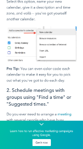
For variant C, the CTA had an X that would completely dismiss the CTA from the post. At this point, there would be no formal CTA on the blog.
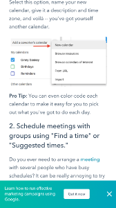
For variant D, the CTA had no X or minimize/maximize option.
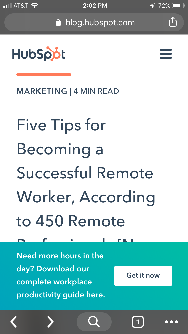
Overall, variant B saw a 7.9% increase, variant C saw an 11.4% decrease, and variant D saw a 14.6% increase.
From those numbers, HubSpot was able to project that using variant D on mobile would lead to about 1,300 additional submissions each month.
2. Groove’s Landing Page Design
Every marketer will have to build a landing page at some point. But building a landing page that’ll convert is hard.
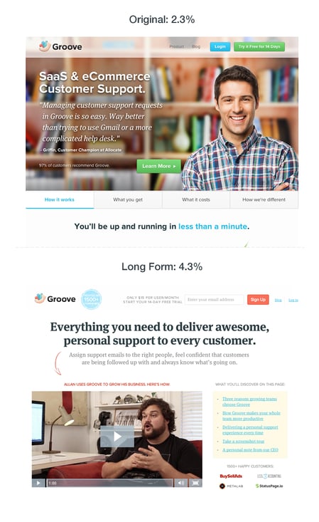
Groove experienced that first hand when the company learned one of its landing pages was only converting at 2.3%.
However, Groove wasn’t sure why the page wasn’t converting. To figure it out, its team went on a journey. They looked up resources and talked to marketing experts to figure out why their site wasn’t working.
That’s when the company learned that the messaging was all wrong. To figure out how to appeal to its customers, Groove decided to reach out and actually talk to real users.
Then, when the team rebuilt their landing page, they focused on copy first, and design second. Only when the copy was completely finished and approved did they start the visual aspect of designing.
Overall, the tweaks to messaging ultimately doubled their conversions to 4.7%.
3. HubSpot’s Site Search
Most websites contain a search bar at the top of the page that gives users the ability to search for a specific topic or term on the site.
Based on previous data, HubSpot found that non-bounce desktop users who engage with search have a 163.8% higher blog lead conversion rate than those who do not. However, only a very small percent of blog traffic interacts with the search bar. That’s why HubSpot decided to test the visual prominence and functionality of the site search bar.
HubSpot used three variants for this test, using offer thank you page views as the primary metric.
For variant A, the site search bar increased visual prominence and altered the placeholder text to “search by topic.”

For variant B, the search bar had increased visual prominence, the placeholder text was altered to “search by topic,” and the search function searched the blog, rather than the whole site.
For variant C, the search bar had increased visual prominence, the placeholder text was changed to “search the blog,” and the search function searched the blog, rather than the whole site.

As a result, HubSpot found that all three variants increased the conversion rate. However, variant C showed a 3.4% increase in conversion rate and a 6.46% increase in users who engage in the search bar.
4. Csek Creative Homepage Design
The copy on your homepage is important because it helps users decide whether they want to continue looking deeper into your site.
In this example, a digital agency decided to test the tagline on its homepage. Ultimately, the goal was to decrease the bounce rate.
Before the A/B test, Csek’s tagline read: “Csek Creative is a Kelowna based digital agency that delivers the results that make business sense.”
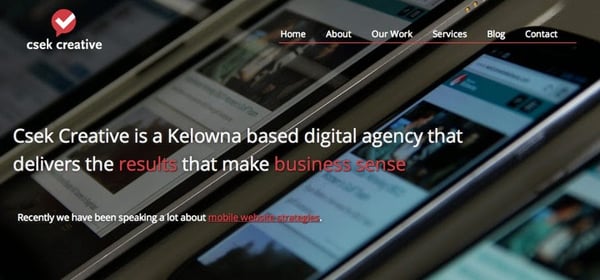
To make the copy less vague and more explanatory of the services it offered, Csek Creative changed the verbiage to: “Csek Creative is a digital agency that helps companies with their online and offline marketing needs.”
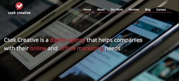
Expecting minor results, this change actually resulted in an 8.2% increase in click-throughs to other pages on the site.
5. HubSpot’s Email vs. In-App Notification Center
Gathering reviews from users isn’t always an easy task. That’s why HubSpot decided to A/B test ways to reach out to customers. The methods tested? In-app notifications versus email.
HubSpot decided to send an in-app notification and email alerting users that they were the champion user of the month and would receive a $10 gift card if they left a review on the Capterra site.
For variant A, HubSpot sent a plain text email to users.
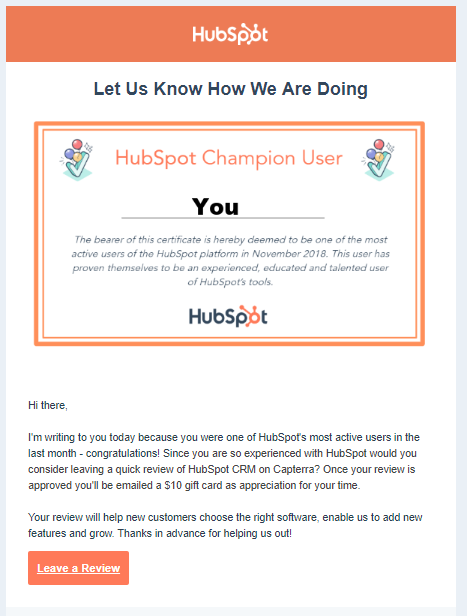
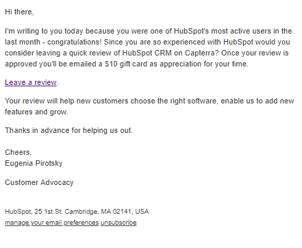 For variant B, HubSpot used a certification, templated email.
For variant C, HubSpot sent an in-app notification.
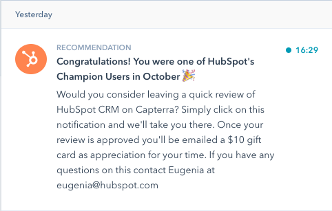
HubSpot found that unlike with emails, in-app notifications are often overlooked or missed by users. The emails outperformed in-app notifications by 1.4x. From both emails, 24.9% of those who opened the email left a review, compared to 10.3% of those who opened the in-app notification.
6. Humana’s Site Banners
Many landing pages showcase large banners at the top of the page. That’s valuable real estate, and if the banner isn’t optimal, it could end up doing more harm than good.
That’s why Humana, a healthcare insurance provider, decided to test its landing page banners.
In the control, Humana had been using a banner that displayed a lot of copy, a weak CTA, and no clear and concise message.

However, for variation B the company decided to simplify the message. This variation ended up receiving 433% more clickthroughs than the control.
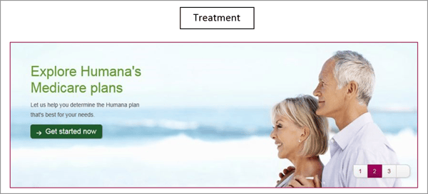
Humana didn’t stop there. Once variant B became successful, the company decided to make it the new control and wanted to test the CTA.
With variation C, Humana switched the CTA language to include language that was a harder sell, such as “Shop.” The company decided this would be a good approach because customers signing up for Medicare have a limited window to make a decision.

The change in language resulted in a 192% increase in clickthrough.
7. Unbounce’s Tweet vs. Email CTA
On most landing pages, marketers typically ask users for an email address to deliver their content offers.
However, Unbounce decided to test whether customers would rather give an email address or just tweet about a product.
Both options have pros and cons for the company. Asking for an email address means your company can build a list of potential prospects while asking people to tweet can build viral momentum and increase social exposure.
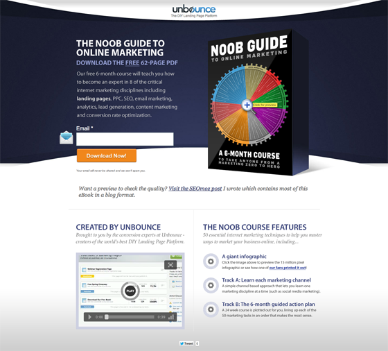
The first landing page in this A/B test asked users to give their email address in exchange for an ebook.
The second landing page asked users to send a tweet in exchange for the ebook.
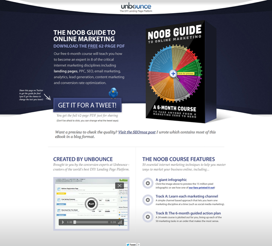
Overall, people far preferred giving out an email address. In the end, the email landing page had a 24% conversion lift.
These companies all saw these amazing results because they started testing. If you want to get the same results, you’ve got to get started, too. For more information, be sure to check out the on-demand webinar “Optimize Your Online Marketing Channels,” hosted by Optimizely and HubSpot.
Editor’s note: This post was originally published in October 2014 and has been updated for comprehensiveness.
![]()
Original Entry: 7 Incredible Examples of A/B Tests by Real Businesses is shared from https://blog.hubspot.com/marketing/a-b-testing-experiments-examples via https://blog.hubspot.com/marketing
Check out the original post, 7 Incredible Examples of A/B Tests by Real Businesses that is shared from https://putyourfamilyfirst.wordpress.com/2020/01/17/7-incredible-examples-of-a-b-tests-by-real-businesses/ via https://putyourfamilyfirst.wordpress.com
No comments:
Post a Comment